
For Faculty
Being Creative with Color
by Jackie Luft, Ed.D, Online Accessibility Specialist
Don't use color for emphasis
Everyone loves color. And while it adds so much to the overall look and feel of a webpage or a document on the screen, please remember that about 8% of men and 0.5% of women are affected with red/green colorblindness. This means there is a good chance there are a few students in your courses that will be affected.
Please make sure that you are not using color for emphasis in any of your online instructional material. I am not saying not to use color: color is a really nice thing to add to your course material and it is beneficial for many reasons. One way that I see instructors use color in their syllabus is to show emphasis. For example, you may want your Heading 1 style to be red, to show your Texas Tech team spirit. That is fine, because you are using color to make something visually appealing.
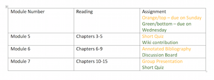
However, if in the table for all assignments, you label all assignments due on Wednesday in green and all assignments due on Sunday in Orange, this will cause confusion. For example:

A person with normal vision can easily decipher which assignment is due when; however, someone with red-green colorblindness might be confused.
Let us look at this second table example. If you are a normal-sighted user, the general look and feel of the table is identical to the first table, but there is a subtle change. Notice how all the Wednesday assignments are on top, and the Sunday assignments are on the bottom? And there is that designation in the assignment box, "Orange/top – due on Wednesday, Green/bottom – due on Sunday." Making simple changes to your content will allow you to still use color in your online instructional material without alienating individuals who are affected by colorblindness. There is not a tool to check your website for color emphasis, but an easy trick is to save it in greyscale and check to see if you can still understand all the content.
Consider color contrast
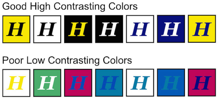
Another area that pertains to color is color contrast. Users may be able to see the screen, but need to use a magnifier or have a hard time differentiating text or images because the words are a similar shade to the background. Also, individuals who are affected by dyslexia or other reading disabilities have a more successful time deciphering content with good color contrast. A good idea is to use a lot of white space and accent your pages with color. For times when you do need a color background, use any of the color contrast checkers on the internet. There are plenty to choose from: here's one from WebAIM. Below is an image of examples of good and low color contrast.
If you have any questions about good color use in your courses, you can let us know at the Online Accessibility Lab!
eLearning & Academic Partnerships
-
Address
Texas Tech Plaza | 1901 University Avenue, Suite 513 | Lubbock, Texas 79410-5095 || Mailing: Box 45095 | Lubbock, TX 79409-5095 -
Phone
Office (806) 742-5944 || Student Support (806) 853-5153 or toll-free (844) 897-0537 -
Email
online@ttu.edu