On this page you will find a a few graphs which display some of the results of the
2015-2016 Wordscapes Exhibit. The first three sets reflect the total data gathered
from both the Humanities Center's interactive kiosk and the Museum at Texas Tech University.
This image set reflects the data for Image 88. As you can see the responses to the
image/caption combinations are very equally distributed.
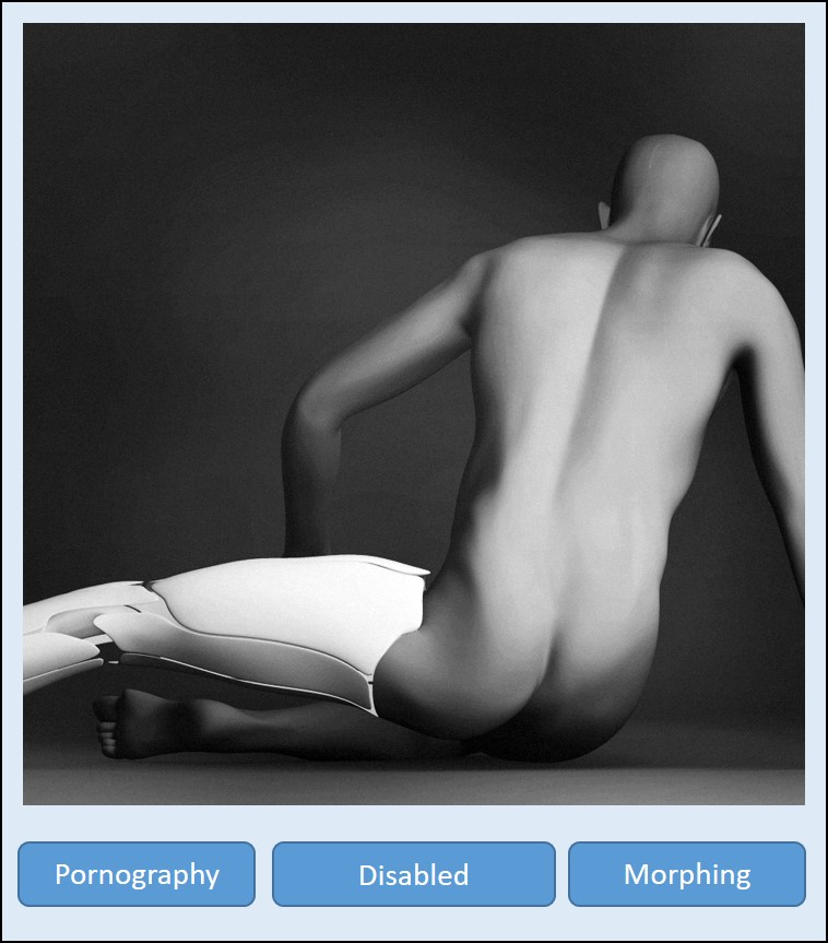
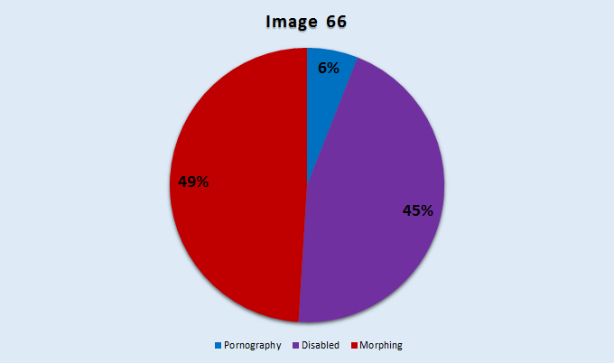
Below is the graph for Image 66. Here we see a majority split between two captions.
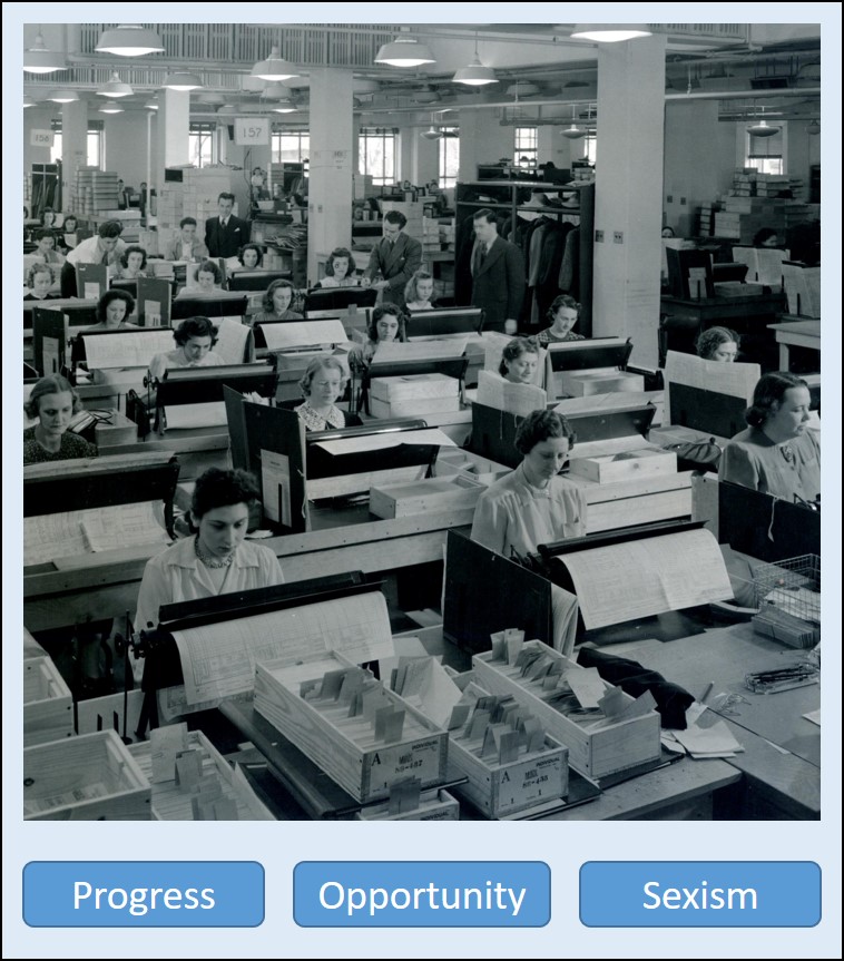
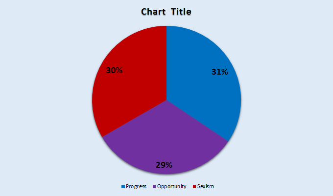
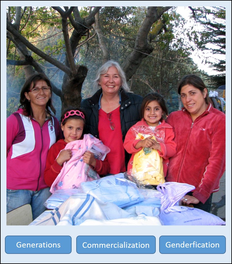
This image set reflects the data for Image 43. Here you can see a single clear majority
opinion in response to the image/caption combinations.
In this section you will see a representation of the data collected exclusively at
the Museum at Texas Tech University. Respondents were asked to identify themselves
as either: University Students, High School Students, Grade School Students, Teachers
(any level), or Community Members. Several images resulted in interesting differences
in response between these areas.
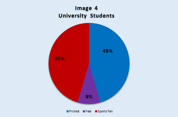
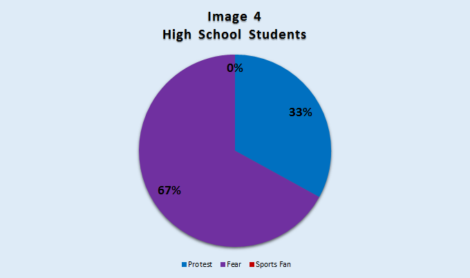
Below is a pair of graphs for Image 4. One displays the data gathered from University
Students, the other reflects High School Students.
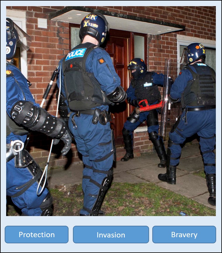
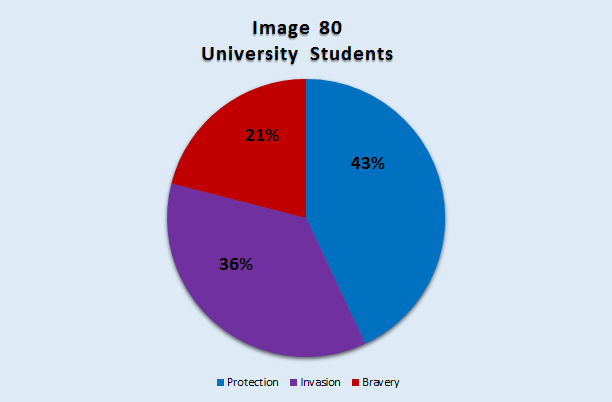
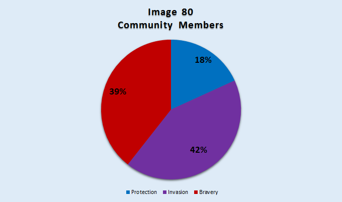
The following graphs compare responses to Image 80 from both University Students and
Community Members.
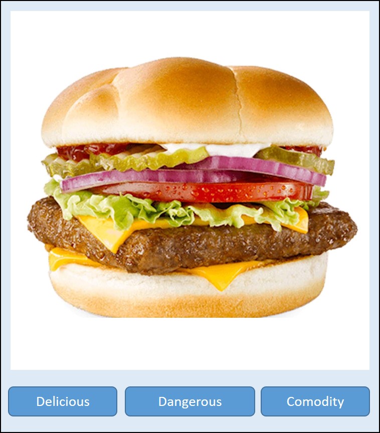
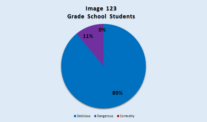
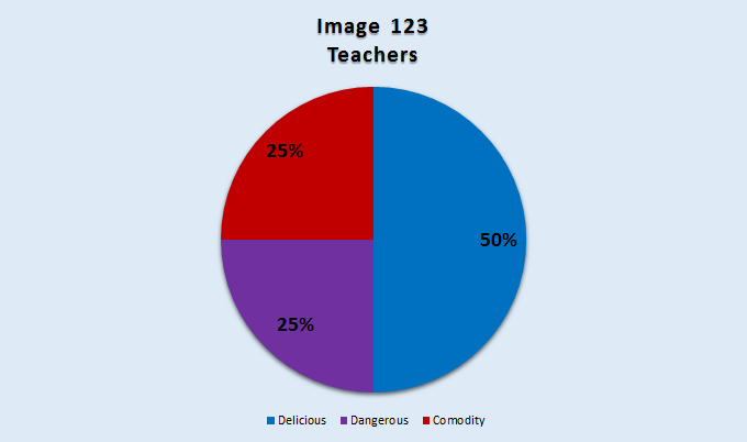
These graphs represent Grade School Students' and Teacher's responses to Image 123.