
Color
Color Contrasts
Text used on your site should have sufficient contrast with its background. This applies to text as part of or overlayed onto images. Specifically, small text should have a minimum contrast of 4.5:1, while larger text (above 18pt or bolded 14pt) should have a contrast ratio of at least 3:1. If possible, one should aim for the higher standard that calls for 7:1 and 4.5:1 contrast ratios for small and large text, respectively. One can use the Contrast Checker from WebAIM to verify that their design is using sufficient color contrast.
Examples
Below, there are three examples of small black text (#1b1b1b as defined by the TTU template) against various shades of red backgrounds. The bottom two samples should be much easier to read. Often, small tweaks to the text and background colors used in your design can bring your contrast scores way up.
Contrast Ratio 2.92:1 - This background (#CC0000, TTU Red) fails the contrast check.
Contrast Ratio 4.53:1 - This background (#FF2424) passes the AA requirement.
Contrast Ratio 7.09:1 - This background (#FF8080) passes the AAA requirement.
Use More Than Just Color
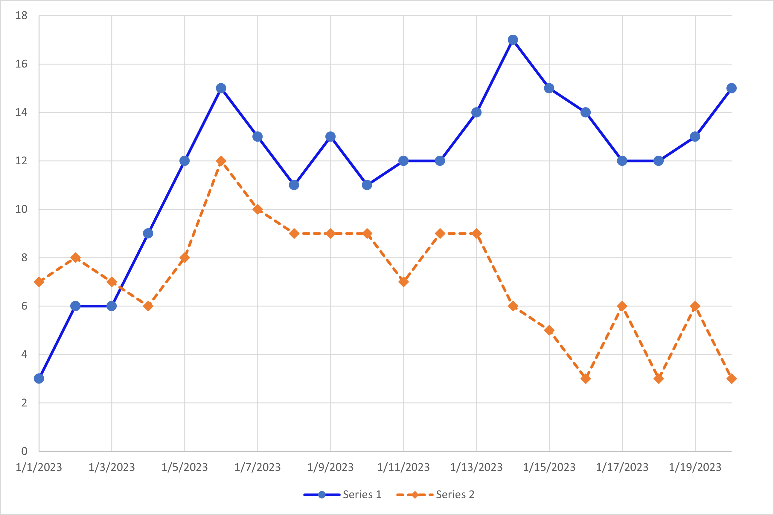
Color should not be the only way that meaning is communicated. As some users may have issues in differentiating and interpreting colors, it is always important to provide multiple ways to determine meaning from an object. In the example above, a line chart of entirely made up data is presented. One series of data is represented with a solid blue line and circles denoting distinct data points. The other series of data is denoted by a dashed orange line with diamonds at the distinct data points. While the series use different colors, they also have different line styles and data point shapes to further differentiate the two objects in the chart. The lines themselves have at least a 4.5:1 contrast ratio with the white background and a 3:1 contrast ratio with each other.
Bad Example: Student Tasks
- Apply to TTU
- Sign up for Housing
- Submit FAFSA
- Attend Orientation
Better Example: Student Tasks
- Apply to TTU: Done
- Sign up for Housing: Incomplete
- Submit FAFSA: Incomplete
- Attend Orientation: Done
IT Technology Support
-
Address
Box 42042, Texas Tech University, Lubbock, TX 79409 -
Phone
806.742.1650 -
Email
ithelpcentral@ttu.edu