
Modern Campus CMS WYSIWYG Toolbar
Within the WYSIWYG (What You See Is What You Get) Editor is a toolbar, which has a variety of functions available to the user to utilize in order to make editing the page easier.
Icons represent every available function to the user. Clicking on any icon performs an action, either directly to the page, or to the selected text and graphics. Some icons display more options in a drop-down menu fashion, or in a pop-up window display.
The availability of a function is based on the selected items, or the location of the cursor on the page. For example, if nothing is selected, functions such as Insert Link are dimmed, signifying that this function is not available at the moment. For the Insert Link function button to be available, the user must first select text or a graphic.
In many cases, right-clicking offers contextual functions. For example, right-clicking within a table provides a list of available table editing and formatting functions. Additionally, commonly used control key combinations are available such as Ctrl-X, Ctrl-C, and Ctrl-V for cut, copy, and paste respectively.
Below is an interactive toolbar with descriptions of the functionality available with each icon. Please click on any icon below to learn about what it does and how you might use it when editing your content.
Click on an icon to learn about it:

Inserts/Edit Form 
Create or edit the form. When creating a new form, set all attributes needed for the form to function properly.
Delete Form 
Highlight the form for deletion and click on the Delete Form icon.
Insert/Modify Input Element 
Insert or modify input field such as check boxes, icons, or events.
Example:
Insert/Modify Section Element 
Insert or modify selection drop-down elements.
Example:
Insert/Modify Text-area Element 
Insert or modify text area elements.
Example:
Insert Horizontal Line 
Adds a horizontal rule.
Insert Line Break 
To insert a line break, click on the Line break icon. This is the same as entering <br /> into the source.
Example:
Sample text
Text after break
Insert Special Character 
To insert a special character such as a copyright symbol, registered trademark, or other characters:
- Click on the Insert Special Character icon.
A pop-up window will appear with a list of special characters.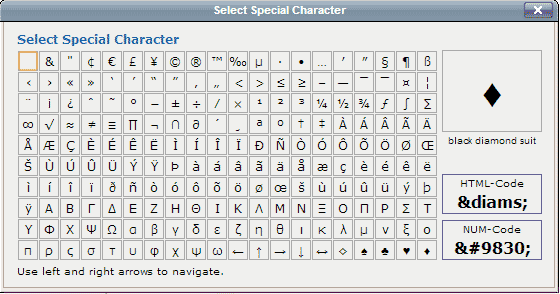
- Click on the icon of the character to insert into the page.
If the HTML numeric equivalent is known, that can be entered in the pop-up as well.
Cleanup Messy Code 
The Cleanup Messy Code icon removes extraneous tags and adds appropriate ending tags where necessary. This helps with cross-browser functionality as well as good general practice.
Show/Hide Guidelines/Invisible Elements 
The Toggle Guidelines/Invisible Elements icon adds/removes the outlines of tables and other elements, for visual purposes only.
Edit HTML Source 
The Edit HTML Source icon opens a code view of the HTML source. If a user has been granted access, there is also an HTML Source Editor available for the source code editing.
Code Protect 
Displays the position of server side code within the WYSIWYG Editor represented by
the icon , allowing for easy editing of server side code (PHP only).
Format 
The Format drop-down lists built-in styles that can be applied to a selected paragraph. To apply an element from the Format drop-down, click within the paragraph (or select text), and then click the element from the drop-down.
This is most commonly used to apply Heading 1-6 formatting to selected text.
<h1> Heading 1
Sample text. Sample text. Sample text. Sample text. Sample text. Sample text. Sample text. Sample text. Sample text. Sample text. Sample text. Sample text. Sample text. Sample text. Sample text. Sample text.
<h2> Heading 2
Sample text. Sample text. Sample text. Sample text. Sample text. Sample text. Sample text. Sample text. Sample text. Sample text. Sample text. Sample text. Sample text. Sample text. Sample text. Sample text. Sample text. Sample text. Sample text.
<h3> Heading 3
Sample text. Sample text. Sample text. Sample text. Sample text. Sample text. Sample text. Sample text. Sample text. Sample text. Sample text. Sample text. Sample text. Sample text. Sample text.
<h4> Heading 4
Sample text. Sample text. Sample text. Sample text. Sample text. Sample text. Sample text. Sample text. Sample text. Sample text. Sample text. Sample text. Sample text. Sample text. Sample text. Sample text. Sample text. Sample text. Sample text.
<h5> Heading 5
Sample text. Sample text. Sample text. Sample text. Sample text. Sample text. Sample text. Sample text. Sample text. Sample text. Sample text. Sample text. Sample text. Sample text. Sample text. Sample text. Sample text. Sample text. Sample text. Sample text. Sample text.
<h6> Heading 6
Sample text. Sample text. Sample text. Sample text. Sample text. Sample text. Sample text. Sample text. Sample text. Sample text. Sample text. Sample text. Sample text. Sample text. Sample text. Sample text. Sample text. Sample text. Sample text.
Style 
This drop-down sets the style of any selected text. The styles available are configured by the system administrator.
Help Icon 
The Help icon displays the help text for the WYSIWYG Editor. It show help text for all available functions, not only those limited to the toolbar being used.
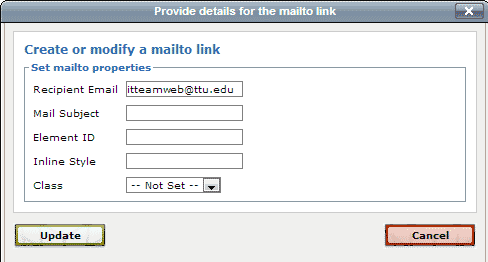
Create or Modify a Mailto Link 
To create a mailto link:
- Select the text or image for the link
- Click on the Create or Modify a Mailto Link icon.
If applicable, the pop-up window will contain existing mailto information. - Use the mailto manager to enter the email address and subject of the email to be sent.
Inserting Anchor Links 
An anchor can be thought of as a bookmark on a page. Once the anchor has been added, a link can be created to it. Anchors can be used to link to a specific location within a web page.
To Create an Anchor
- Place the cursor where the anchor is desired, or select the text or image for the anchor.
- Click the Insert/Edit Anchor button. This displays a dialog box.
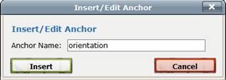
- Enter the name of the anchor.
- Click Insert. This adds the anchor to the HTML. In the WYSIWYG view a small anchor icon represents
the named reference. The view of invisible elements can be toggled off and on from
the WYSIWYG Toolbar.

Note: More than one anchor can be added to a page, but each should have a unique name. Best practices for anchors names include using lower-case letters, numbers, and hyphens. An anchor cannot start with a number or the symbols.
To Link to an Anchor
- After creating the anchor, select the text that will be linked.
- Select the Insert/Edit Link.
- For the Anchors field, use the drop-down to select the anchor from the list.
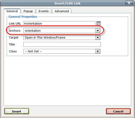
Note: The Anchors drop-down is only shown if the anchor is in the same editable region as the link being created. If the anchor is in a different editable region, when creating the link enter # and the anchor name in the Link URL field. If the anchor is on a different page, browse for the page and add # and the anchor name after the path or Dependency tag.
Align Left 
Moves all selected text to the left.
Align Center 
Centers all selected text.
Align Right 
Moves all selected text to the right.
Superscript 
Turns selected text into superscript text.
Subscript 
Turns selected text into subscript text.
Unordered List 
Turns the selected text into a bulleted list.
Example:
- Item 1
- Item 2
- Item 3
Ordered List 
Turns the selected text into a numbered list.
Example:
- Item 1
- Item 2
- Item 3
Decrease Indent 
To decrease the indent of a paragraph, click on the Decrease Indent icon. Each consecutive click will move text further to the left.
Indent 
To increase the indent of a paragraph, click on the Indent icon. Each consecutive click will move text further to the right.
Bold 
Turns selected text into bold text.
Italic 
Turns selected text into italicized text.
Remove Formatting 
To remove all formatting for a selection, highlight the text to be updated and click on the Remove Formatting icon. This returns the selected text back to the default settings.
Redo 
Click on the Redo icon to redo changes that were just undone and should be restored.
Undo 
Click on the Undo icon to undo the last changes made in this session one-by-one.
Find & Replace 
Click on the Find/Replace icon to search for text on the current page then replace that text with other text.
Find 
Click on the Find icon to search for text on the current page.
Copy 
To copy a portion of the document, highlight the desired portion and click on the Copy icon (keyboard shortcut is CTRL+C for Windows or CMD+C for Mac).
Both Mozilla Firefox and Safari disable the use of keyboard shortcuts but you can still use the icon.
Cut 
To cut a portion of the document, highlight the desired portion and click on the Cut icon (keyboard shortcut is CTRL+X for Windows or CMD+X for Mac).
Both Mozilla Firefox and Safari disable the use of keyboard shortcuts but you can still use the icon.
Revert to Last Save 
Click on the Revert to Last Saved icon to undo all changes and revert the content in the editable region to its original state.
Using Assets 
Assets are preconfigured global elements that are maintained in the Assets section (Content > Assets). Assets can be configured as web content, plain text, or source code only. It is possible that the institution may also have the ability to create image galleries, forms, and comments within the Assets section. Ask the institution’s administrator if these types are available. Assets are accessible across sites, with the exception of forms unless the administrator has chosen differently or if the asset has been locked to the originating site only. They are used to provide consistent information across all pages (e.g., student enrollment number), to protect the integrity of information (e.g., a student testimonial with image), or to configure source code that can be inserted into the page via the WYSIWYG (e.g., a dynamic news feed). Once inserted into the page, assets cannot be modified within the WYSIWYG Editor. An asset can be modified by an administrator or user with access to the Assets section and the particular asset. Once edited and republished, all pages that subscribe to that asset are automatically updated with the new information.
Assets are only as good as how often they are used. If the content to be added to the page appears to have a global element, check the assets to see if one is available fitting those needs. This ensures consistency across pages when the content changes.
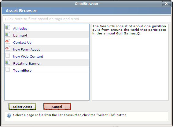
To Insert an Asset with the WYSIWYG Editor
- Click on the Insert/Edit Asset icon.
- Select the desired asset, or search for an asset by a tag, site, or type filter.
- Click on Select Asset.
When the asset is inserted on the page, it is possible that it will not render until the page is saved. Whether or not the asset renders in the WYSIWYG Editor, it is shown in a box with hash marks behind it.
Once the page is saved, the asset should render within the preview. There are some cases in which the asset cannot render until publication. These are generally Source Code assets.
If details about the asset are desired, it is possible to preview an asset in the Assets section found in Content > Assets.
Simply click the Review icon.
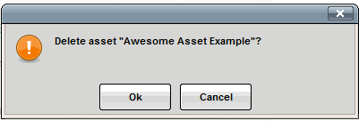
To Delete or Change an Asset on a Page
- 1 Click on the asset so it becomes green and the Insert/Edit Asset icon is highlighted.

- To delete, click on the Delete or Backspace button on the keyboard and confirm the deletion.
- To change, click on the Insert/Edit Asset icon and find a new asset.
Auto-Draft Icon 
The lifesaver icon represents the Auto-Draft feature. Once a user begins entering content within the editable region, the Auto-Draft creates a backup on the local workstation in the browser’s cache or Internet files approximately every minute. The backup is generally available for up to 24 hours, but it is contingent on the user’s browser settings.
If the browser shuts down unexpectedly, Internet connectivity is lost prior to the content being saved, or if power is lost, content can be retrieved by following the steps below:
- Open the same browser on the same workstation that was being used to edit the page. For example, if the page was being edited in Mozilla Firefox when the connection was lost, the Auto-Draft retrieval must be completed in Firefox as well, and on the same local system.
- Navigate to the page that was being edited.
- Access OU Campus via the DirectEdit link and log in.
- Click into the editable region that was being edited prior to the loss of connection.
- Before entering any content into the page, click on the Auto-Draft icon.
- Click OK on the pop-up.
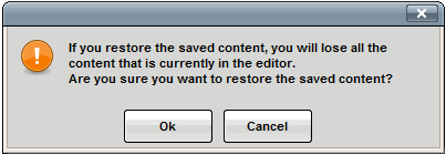
- The saved content is restored.
Table Cell Properties 
Defines the cell properties such as alignment, width, height, and background color. Then applies the updates to the current cell, all cells in the row, all cells in the column, or all cells in the table.
Delete Column 
Deletes the column the cursor is in.
Delete Row 
Deletes the row the cursor is in.
Inserting Images 
The insert images and media options provide an easy way to include images and videos on the web page. When inserting media, it is possible to select from images and videos that have already been uploaded to the production server. If permission has been granted, users can upload images and videos to the production server. Also, it is possible to insert links to display external resources, such as YouTube videos.
Keep in mind that the system may be set up to place the user in a particular folder within the site structure where media is housed. It is advised that media not be uploaded to a different location if a particular media folder opens when the browse button is clicked on unless told otherwise.
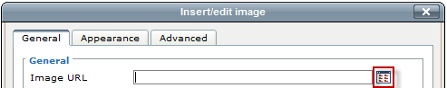
Inserting Images
- Click on the Insert/Edit Image icon: .
- Enter the URL to the external media or click on the browse button next to the Image URL field and find the image to be included.
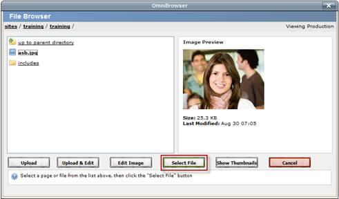
- If browsing for an image in the file chooser, simply navigate to and click on the desired image. The navigation is similar to that of inserting links.
- Click Select File. It is possible to click on Show Thumbnails to see thumbnails of all of the images within the directory in order to easily select
the desired image.
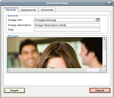
- After selecting the image, add an Image Description. This is required and is used by screen readers for accessibility standards compliance.
- The Title field is optional.
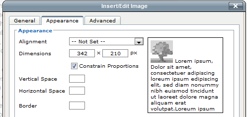
- Specify any other options and click Insert. Other options are available on the Appearance tab to control specific visual characteristics for the image.
|
Setting |
Description |
|
Alignment |
Includes several alignment options for images. A preview of the alignment can be seen on the right. |
|
Dimensions |
Can be used to change the size of an image. Use with Constrain Proportions to ensure that the length of each side is increased or reduced proportionally. |
|
Constrain Proportions |
Use to ensure that the length of each side is increased or reduced proportionally. |
|
Vertical Space |
Adds a top and bottom margin to the box object. By default the amount is measured in pixels. If 20 is entered, a 20px margin is added to both the top and the bottom of the image. Generally between 3 and 5 pixels provide enough spacing without being excessive. |
|
Horizontal Space |
Adds a left and right margin to the box object. By default the amount is measured in pixels. If 20 is entered, a 20px margin is added to both the left and the right of the image. generally between 3 and 5 pixels provide enough spacing without being excessive. |
|
Border |
Adds a border to the image and is measured in pixels. A 1 to 2 pixel border is usually sufficient. |
|
Class |
Select a class from the drop-down for a style as already defined and similar to the choices available in the Styles drop-down. |
|
Style |
Displays the inline CSS defined by the fields above or can be used to define inline CSS. |
Insert/Edit Image General Tab
Insert/Edit Image > Appearance Tab
Uploading New Images
If the necessary image has not already been uploaded to the production server, it can be uploaded through the file browser. Keep in mind that the availability of the Upload button (and Upload & Edit) is based on permissions.
- After clicking the Browsebutton in the resulting File Browser and navigating to the location of the expected file, click the Upload button.
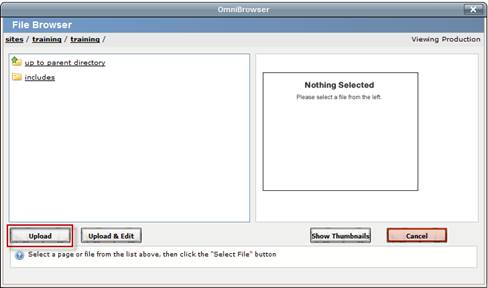
- Browse for the desired file locally.
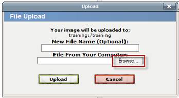
- If necessary, rename the file in the New File Name (Optional) field. Be sure to include the file extension.
- After finding the desired file on the local computer, click Upload.
- Select the newly uploaded file to insert it on the page following the directions described above.
When uploading images, keep in mind that typical images should be:
- 72 dpi
- No larger than 200 x 200 pixels, unless a banner image
- No larger than 50 kilobytes in file size
Editing Images
It is possible to edit an image before inserting it on the page. This should be used with restraint as editing an image through the file chooser changes the image on the production server and any instances of that image being used on other pages.
To edit an image while uploading it, use the Upload & Edit button at the base of the insert image window. Otherwise, simply use the Edit Image button after selecting an image already on the server. Editing the image on upload, functions the same as editing the image after the fact, but creates a copy of the image generally.
Note: This requires that a current version of Java be running on the computer.
- Select the image to be edited.
- Click the Edit Image button.
- Make the necessary changes to the size, cropping, and orientation.
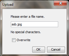
- Click on the Upload Asbutton to upload to the production server. Clicking the Save As button will save the image to the local system.
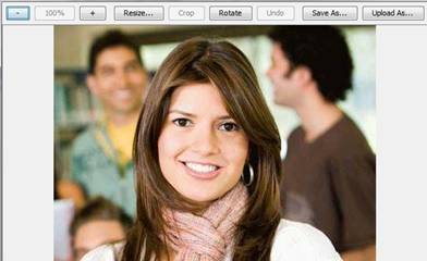
- Name the edited image. Based on permissions, it may be possible to overwrite the existing file with the newly edited file. Remember, overwriting the file affects all pages on which the image has been placed.
- Click OK
.
- The image can now be selected and inserted as a modified image.
To edit an image that has been inserted on a page, simply click on the image, and then click on the Insert/Edit Image icon. Follow the steps outlined above to edit, modify the appearance of, or replace the image.
Insert Column Before and Insert Column After 
Use the first icon to insert a column to the left of the column the cursor is in, and use the second icon to insert a column to the right of the column the cursor is in.
Insert Row Before and Insert Row After 
Use the first icon to insert a row above the row the cursor is in, and use the second icon to insert a row below the row the cursor is in.
Creating Links 
Links are created by highlighting text or an image and clicking the Insert/Edit Link icon. The Insert/Edit Link icon is dimmed until the text or image to be hyperlinked is selected. Links can point to internal web links, external websites not maintained in OU Campus, or other pages within OU Campus. The Insert/Edit Link icon can also be used to create links to files, such as PDFs.
Links and Dependency Manager
It is possible for links to pages or directories maintained within OU Campus to be updated automatically when the page or directory to where the link is pointed is moved or renamed. The links are tracked by Dependency Manager. When Dependency Manager is activated, it is important to browse for the appropriate page in order to ensure that the link will be updated if the target page or directory is moved or renamed.
Dependency Manager currently manages links to other pages in your OU Campus account, which may be different subsites of your institution. However, it does not manage links to external websites such as CNN, nor binary files such as PDFs and images.
Tags appear as follows:
- {{d:####}} - Directory tag
- {{f:####}} - File/Page tag
- {{a:####}} - Asset tag
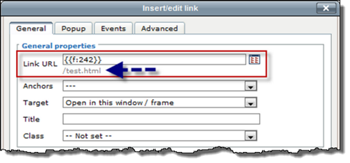
Example of Dependency Tag
Inserting a Link
A link to a page or file within OU Campus can be inserted and it works within a site or across sites within an account. In this case, the page should be browsed to so that the Dependency tag is inserted rather than a path or URL.
- Highlight the text or image to link.
- Click the Insert/Edit Link icon.
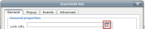
- Click on the Browse button. This opens the File Browser.
- Find the file to which the link should be created.
- If necessary, select an auxiliary site or publish target.
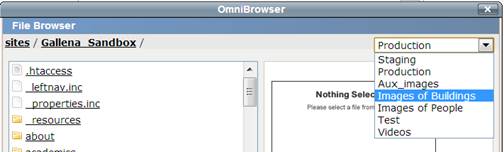
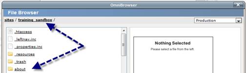
- If the desired page is not in the selected directory, use the breadcrumb at the top of the page and the folders within the window to navigate to the desired page.
- Click Select File.
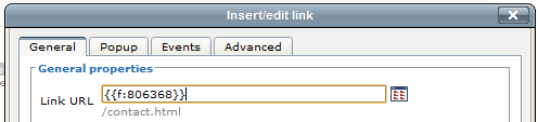
- When inserting a link using Dependency Manager, instead of the URL appearing in the Link URL field, a Dependency tag is shown. The target URL is shown underneath the Link URL field.
- Choose an Anchor, if necessary.
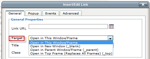
- Select the Target.
As a general rule of thumb, when inserting a link to another page on the institution’s website, the link should open in the same window. When inserting a link to a page outside the institution’s website, or to a PDF, DOC, or other similar file, the page should open in a new window. This selection is made in the field labeled Target:
- Linking to pages on the institution’s website: Open in This Window/Frame
- Linking to pages on another site or binary files: Open in New Window (_blank)
- Enter the Title. It is both valuable and important to populate the Title field as this is used by screen readers and helps keep the site in compliance with accessibility compliance standards.
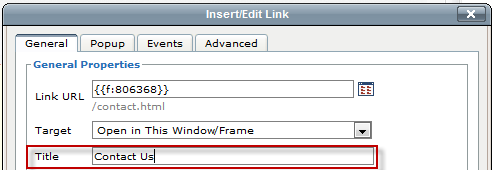
- Click Insert.
Note: The text entered in this field is used to create the title attribute for the <a> element in HTML. A developer might use this attribute to display the text when mousing over the link. Here’s what it looks like in HTML:
<a title="Contact Us" href="{{f:806368}}">test</a>
Linking to Unpublished Files on Staging
- Adjacent to the Link URL field, click the Browse icon.
- From the drop-down, select Staging.
- Navigate to the file and click the PCF version of the file. This displays the various outputs such as HTML and PDF file formats.
- Select the corresponding version; e.g., myfilename.html.
- Click Select. The appropriate dependency tag populates the filed.
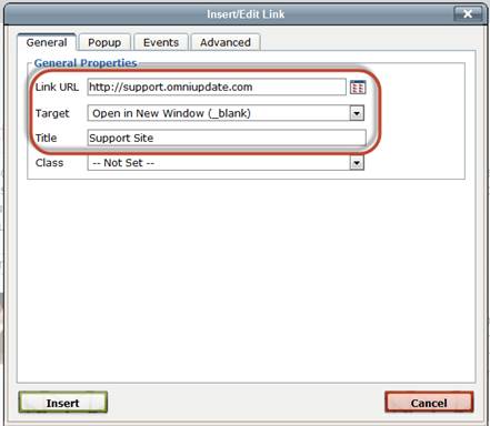
Inserting a Link to an External Site
- Highlight the text or image to link.
- Click the Insert/Edit Link icon.
- Enter the link information, including Link URL, Target, and Title.
- Click Insert.
More Details
The fields on the General tab are as follows:
- Link URL: Used to specify where to link to. For external web pages, enter a fully qualified URL. For internal pages and files, browse to the location.
- Target: Used to specify how the linked-to page is displayed. For example, external links often are configured to display in a new browser tab; internal links, within the same browser window.
- Title: The title is an HTML attribute for the link and is often used to display a message
on mousing over a link. This is also valuable for meeting accessibility standards.
- Class: Can be used to apply a CSS class to the link, if this has been configured.
Editing a Link
To edit a link that has been inserted on a page, simply click on the link, and then click on the Insert/Edit Link icon. Follow the steps outlined above to modify the link.
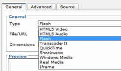
Inserting Media 
In addition to images, it is possible to insert other types of media, such as video and audio files.
To Insert a Video or Audio File
- Click on the Insert/Edit Embedded Media icon:
- For the Type field, select the format in which the media should be inserted. The default is Flash.
- Enter the URL to the external media or click on the Browse button next to the File/URL field, and find the file to be included.
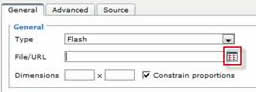
- If browsing for media in the file chooser, simply navigate to and click on the desired file, similarly to browsing for images.
- Click Select File.
- Update any other settings that may need to be updated. The settings in the Advanced tab are controlled by the Type selection made on the General tab.
- Click on Insert.
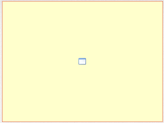
The media does render within the WYSIWYG Editor. Instead it is shown as a yellow box the size of the intended media. Once the page is saved, the video renders in the preview.
Troubleshooting Media
There are a few reasons why a video may not render:
· The browser used to view the page does not have the correct plugin.
· The type of media specified is incorrect for the media. Make sure the video appears in the Preview screen inside of the Insert Media window.
· The video file has an incorrect or invalid file extension.
Based on permissions, it may be possible to upload new media files. This process mimics that of uploading new images.
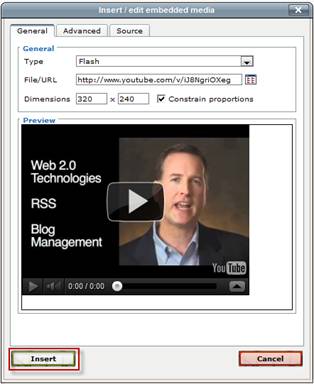
Inserting a YouTube Video
Inserting a YouTube video only takes a few steps.
- Find the video on YouTube.
- Copy the URL for the video from the top address bar.
- Go back to the page in OU Campus, and place the cursor at the location where the video should be displayed.
- Click on the Insert/Edit Media icon.
- Paste the YouTube URL into the Link URL box.
- Click on Insert.
If desired, the dimensions can also be updated to define the size of the displayed video.
Merge Table Cells 
To merge cells, highlight the cells to be merged, then click on the Merge Table Cells button. Merges the selected table cells into one cell by adding the necessary colspan and/or rowspan attribute(s). It is also possibly to simply place the cursor in the upper, left most cell, and then click the Merge Table Cells icon. A prompt will appear in which the desired number of columns and/or rows to be merged needs to be entered. When merging cells, all of the content currently within the cells will remain.
Paste 
Paste is configured to remove all formatting. Paste as plain text is used to ensure that the page is adhering to the institution’s style guidelines.
Deleting a Link 
To delete a link, click on the link, and click the Unlink icon.
Table Row Properties 
Defines the row properties such as alignment, height, and background color. Then applies the updates to the current row, all odd rows, all even rows, or all rows.
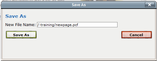
Save As 
The Save As icon allows the user to save the page with a new name, essentially creating a copy of the page. The new page can then be modified and published independently of the original file.
Click the Save As icon and provide the new name in the New File Name Field. Change only the name of the page, but leave the extension of .pcf in place. This is extremely important. If any other extension is used, the page will not render as the header, footer, and styling will not be included. The page path can be changed as well.
Save 
The Save icon allows the user to save the changes that have been made to the page. Using the Save icon will also close the WYSIWYG Editor and take the user to a preview of the page. If the user desires to save-in-place while continuing to edit, simply use the keyboard shortcut (CTRL+S for Windows and CMD+S for Mac).
Snippets
Snippets are preconfigured code that can be inserted onto the page to make it easier to keep certain elements consistent and to make it easier for the end user to include formatted elements. A snippet can be thought of as a content template. Snippets are edited in the WYSIWYG Editor and appear as regular content. An example of a snippet is a table. The institution may have a certain table format that all pages should use. A snippet may contain this formatting, but once inserted onto the page, the snippet code becomes part of the page and can be modified as needed.
Another example is an image and a caption. The image and caption text may change, but the formatting and classes remain the same.
To Insert a Snippet
- Click on the Insert Predefined Snippet Content icon.
- Select the desired Category.
- Select a snippet to be inserted.
- Click Insert.
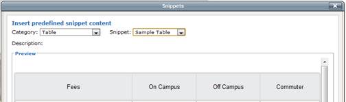
The snippet can now be modified to meet the needs of the page using the standard WYSIWYG toolbar.
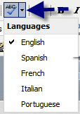
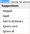
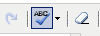
Spell Checker 
The spell checker can be activated by clicking on the ABC with the checkmark icon. The default dictionary is in English. However, if the page should be edited in another language (available languages are: English, Spanish, French, Italian, and Portuguese), simply click on the downward facing arrow and select another language.
Misspelled words are identified with a wavy, red line.
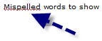
To fix the misspelled word, simply click on it. This displays a list of available options. Select the appropriately spelled word, ignore the word, or, if access has been granted, add the word to the dictionary.
 Keep in mind that the browser’s spell checker may be active and marking words as misspelled
while the page is being edited. However, only OU Campus’ spell checker references
the OU Campus custom dictionary. To help verify that a word is being marked as misspelled
by the OU Campus dictionary, look to see if the spell check icon is highlighted. This
indicates that the OU Campus spell checker is being used.
Keep in mind that the browser’s spell checker may be active and marking words as misspelled
while the page is being edited. However, only OU Campus’ spell checker references
the OU Campus custom dictionary. To help verify that a word is being marked as misspelled
by the OU Campus dictionary, look to see if the spell check icon is highlighted. This
indicates that the OU Campus spell checker is being used.
Split Merged Table Cells 
To split cells that have previously been merged, select the cell then click on the Split Merged Table Cells button. If within a merged cell (contains a colspan and/or rowspan), this will remove the colspan and/or rowspan attribute(s) to result in individual cells matching the table’s non-merged configuration.
Tables
Using tables in OU Campus is similar to how tables function in Word. The tools will activate when the cursor is within a table. A table may already exist on the page, be part of a snippet that is inserted on the page, or be added during editing of the page.
Create a New Table
- Click on the Insert/Edit Table icon:

- Complete the pop-up. Use the Advanced tab to configure background and border color options, among other advanced options.
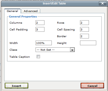
- Click Insert.
- Add content to the table by using the mouse or keyboard arrows to navigate between cells. It is also possible to use the other available tools in the WYSIWYG toolbar to add and configure cell content.
Table Row Properties
Defines the row properties such as alignment, height, and background color. Then applies the updates to the current row, all odd rows, all even rows, or all rows.
Table Cell Properties
Defines the cell properties such as alignment, width, height, and background color. Then applies the updates to the current cell, all cells in the row, all cells in the column, or all cells in the table.
Insert Row Before and Insert Row After
Use the first icon to insert a row above the row the cursor is in, and use the second icon to insert a row below the row the cursor is in.
Delete Row
Deletes the row the cursor is in.
Insert Column Before and Insert Column After
Use the first icon to insert a column to the left of the column the cursor is in, and use the second icon to insert a column to the right of the column the cursor is in.
Delete Column
Deletes the column the cursor is in.
Split Merged Table Cells
To split cells that have previously been merged, select the cell then click on the Split Merged Table Cells button. If within a merged cell (contains a colspan and/or rowspan), this will remove the colspan and/or rowspan attribute(s) to result in individual cells matching the table’s non-merged configuration.
Merge Table Cells
To merge cells, highlight the cells to be merged, then click on the Merge Table Cells button. Merges the selected table cells into one cell by adding the necessary colspan and/or rowspan attribute(s). It is also possibly to simply place the cursor in the upper, left most cell, and then click the Merge Table Cells icon. A prompt will appear in which the desired number of columns and/or rows to be merged needs to be entered. When merging cells, all of the content currently within the cells will remain.
IT Technology Support
-
Address
Box 42042, Texas Tech University, Lubbock, TX 79409 -
Phone
806.742.1650 -
Email
ithelpcentral@ttu.edu