
Reports and Analyses
The Role of Place: A Report on the Demographic Setting of Texas Tech University
The role of place in policy discussions is, according to a recent report on “Education Deserts” by the American Council on Education, often underemphasized. Vast stretches of the Midwest and plains states are termed education deserts by the measures used in their report, including much of the South Plains region where Texas Tech University is situated. If place is generally important across the nation, it is higher still in the lower density regions of the country, where choices are fewer. For many students on the South Plains, if they do not attend or transfer to Texas Tech University (TTU), they will not attend a four-year university at all.
As such, the College of Arts & Sciences has begun to compile data and visualizations that will hopefully prove relevant to regional grantwriting. A point of pride for TTU has been our rapid ascent in rankings of research activity, as evidenced by our inclusion in the last few years on the Carnegie Foundation's list, "R1: Doctoral Universities – Highest Research Activity." This serves as an excellent basis for understanding just how remarkable this achievement is. Using the Circular Area Profiles tool built by the Missouri Census Data Center to scrape 2016 ACS data in a 100-mile radius around each of the universities on the list, the South Plains region surrounding Texas Tech University leaps to attention.
Before getting to the results, a few caveats should be mentioned. A 100-mile radius is well-suited to the scale of much of much of the West and midwest, where distances can be large and cities widely spaced. Traveling 100 miles from Lubbock, Texas in a northern direction fails to bring one to Amarillo, the only city of significant size directly north of TTU; likewise, 100 miles to the south does not bring one to Midland/Odessa. In light of this reality and a College Board study showing the median distance from home traveled by American students to their college of choice to be 94 miles, 100 miles seemed a somewhat arbitrary but appropriate measure. One can instantly spot that it is less well-suited to parsing between universities situated on densely populated regions of the east or west coast, where two main issues arise. With ocean areas excluded from demographic calculation, coastal cities present a region of study that is unavoidably closer to half-circle than a full circle (and census data being only provided for the USA, the circular area profile of a coastal border city such as UC San Diego further narrows to a wedge). At the same time, 100 miles in areas with a high density of cities may encompass too many different regions to be particularly meaningful in differentiating between broadly similar results.
So, with these caveats, let's take a look at some top/bottom ten lists for the broader regions of all 115 Carnegie Highest-Research-Activity universities in the United States. You may also download a full spreadsheet with these and other results.
Most Rural (100-mile radius; 2016 ACS; reverse sort population density per square mile)
1. Texas Tech University (23.2 people per square mile)
2. Washington State University (33.3 people per square mile)
3. University of New Mexico-Main Campus (37.8 people per square mile)
4. Kansas State University (43.2 people per square mile)
5. Iowa State University (53.8 people per square mile)
6. University of Nebraska-Lincoln (55.6 people per square mile)
7. University of Missouri-Columbia (62.2 people per square mile)
8. University of Iowa (65.2 people per square mile)
9. Florida State University (68.6 people per square mile)
10. University of Oklahoma-Norman Campus (75.0 people per square mile)
...
106. University of California-San Diego (1241.5 people per square mile)
107. University of Pennsylvania (1282.3 people per square mile)
108. Temple University (1296.4 people per square mile)
109. Yale University (1307.0 people per square mile)
110. Princeton University (1388.8 people per square mile)
111. Rutgers University-New Brunswick (1394.2 people per square mile)
112. Columbia University in the City of New York (1406.0 people per square mile)
113. CUNY Graduate School and University Center (1436.4 people per square mile)
114. New York University (1442.7 people per square mile)
115. Stony Brook University (1493.9 people per square mile)
Lowest Rate of Educational Attainment (100-mile radius; 2016 ACS; reverse sort percent population with bachelor's degree or more)
1. Texas Tech University (20.4%)
2. Case Western Reserve University (21.1%)
3. University of Pittsburgh-Pittsburgh Campus (22.0%)
4. Pennsylvania State University-Main Campus (22.2%)
5. University of South Florida-Main Campus (22.7%)
6. University of Nebraska-Lincoln (22.7%)
7. West Virginia University (23.0%)
8. University of Kansas (23.1%)
9. University of Florida (23.5%)
10. Clemson University (24.2%)
...
106. University of California-Santa Cruz (38.4%)
107. Texas A M University-College Station (38.7%)
108. University of Rochester (39.0%)
109. University of Pennsylvania (39.2%)
110. University of Illinois at Chicago (39.2%)
111. University of Chicago (39.3%)
112. Syracuse University (39.6%)
113. University of North Carolina at Chapel Hill (40.3%)
114. Carnegie Mellon University (41.0%)
115. University of Michigan-Ann Arbor (41.4%)
Highest Agricultural Employment (100-mile radius; 2016 ACS; sort agricultural employment)
1. Texas Tech University (10.2%)
2. University of Oklahoma-Norman Campus (5.3%)
3. Washington State University (4.7%)
4. Louisiana State University (4.6%)
5. Iowa State University (3.9%)
6. Rice University (3.8%)
7. University of Houston (3.8%)
8. University of Iowa (3.5%)
9. University of Nebraska-Lincoln (3.4%)
10. University of Oregon (3.4%)
...
106. University of Pennsylvania (0.5%)
107. Temple University (0.5%)
108. University of Connecticut (0.4%)
109. Princeton University (0.4%)
110. Rutgers University-New Brunswick (0.4%)
111. Yale University (0.3%)
112. Columbia University in the City of New York (0.3%)
113. CUNY Graduate School and University Center (0.3%)
114. New York University (0.3%)
115. Stony Brook University (0.3%)
Highest Hispanic Population (100-mile radius; 2016 ACS; sort percent Hispanic population)
1. University of New Mexico-Main Campus (48.7%)
2. University of California-San Diego (45.9%)
3. University of California-Los Angeles (45.1%)
4. California Institute of Technology (44.8%)
5. University of California-Santa Barbara (44.7%)
6. University of Southern California (44.7%)
7. University of California-Irvine (43.8%)
8. University of California-Riverside (43.5%)
9. Texas Tech University (42.2%)
10. University of Miami (41.6%)
...
106. Case Western Reserve University (4.0%)
107. University of Cincinnati-Main Campus (3.6%)
108. University of Louisville (3.4%)
109. University of Kentucky (3.2%)
110. University of Missouri-Columbia (2.9%)
111. Ohio State University-Main Campus (2.8%)
112. Washington University in St Louis (2.6%)
113. West Virginia University (1.6%)
114. Carnegie Mellon University (1.6%)
115. University of Pittsburgh-Pittsburgh Camp (1.6%)
Putting these numbers side by side makes it clear why they were worth collecting in the first place. Whether Texas Tech University is truly the most rural highest-research-activity university in the country is a subjective question; it depends on how you define rural and draw the boundaries. It is likewise unlikely that we would get absolute consensus on Stony Brook University being the single most urban university in the country. Yet seeing the top-and-bottom-ten lists side by side present a clear picture of vastly different worlds. What we can say with absolute confidence is that Texas Tech University is located in one of the most rural regions in the country, with one of the highest rates of agricultural activity; one of the lowest levels of educational attainment; and one of the highest Hispanic populations.
That is the setting, but are we having an impact? One indicator of our social impact is the fact that we recently surpassed the enrollment thresholds necessary to become designated a Hispanic-Serving Institution. Other indicators are best told visually. The following maps, put together for the benefit of anyone reading, present the rates at which TTU draws students from various regions, based on the composition of the student body in Fall '17. (Please bear with the blurry/pixelated maps for now, they will be fixed. If you would like to use some version of these in your work, please contact the A&S grant editor).
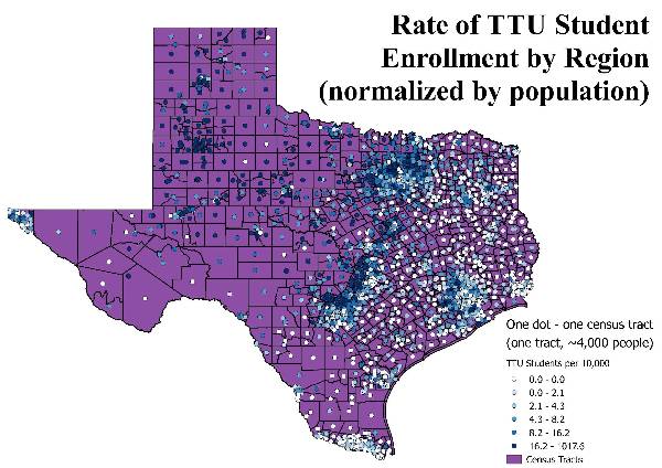
With the color showing the rate at which students come to Texas Tech from a given region (darker corresponding to a higher rate of students relative to population), and the spacing of the dots reflecting the population density of Texas itself, we can get a decent picture of the influence of geography on student choice. The scope of TTU's highest geographic influence is clearly all around it, running through the rural regions from Lubbock to Dallas. Remember that this is a region of some of the lowest population density and some of the lowest educational attainment surrounding any top tier research institute in the nation. Nevertheless, we have a steady clip of enrollment. The background awareness is that, for many students from this regions, if TTU does not prove sufficiently enticing to convince them to enroll, there is a high chance that they will not enroll in any four-year institution. Furthermore, though it is not pictured here, there are a disproportionate number of students from these regions who come to TTU through the transfer pathway, staying close to home for as long as possible at 2-year institutions.
Beyond the Dallas-Fort Worth area, students are presented with a vast number of four-year options that will also be closer-to-home for them than TTU; it is not a surprise that students come to TTU at a lower rate. The population density is many times higher in these regions, so we still receive the bulk of our students from Dallas, Austin, and Houston. Nevertheless, it is reasonable to suggest that we are most influential in the South Plains, and that this is where it is possible for the decisions of TTU and its programming to most profoundly affect the future of the region. Given the extent to which these regions also represent a perfect storm of risk factors for educational attainment--highly rural, currently low rates educational attainment, low income, etc.--an awareness of our setting is vital. In the language of grantwriting, this is the population where our efforts are likely to have the highest impact.
With Texas Tech University on the path to becoming a Hispanic-serving institution, it is worth looking at where these students come from. As before, we should mention a few caveats regarding both the map we just looked at and the one to come. The shading reflects the particular composition of our student body in Fall '17. Fall '18 could see a different distribution; any given white dot (corresponding to zero students from that particular region) could see a half-dozen students suddenly appear and make the region look as if it were the epicenter of a major recruitment event. But it would probably just be statistical noise. More significant is the state-level story:
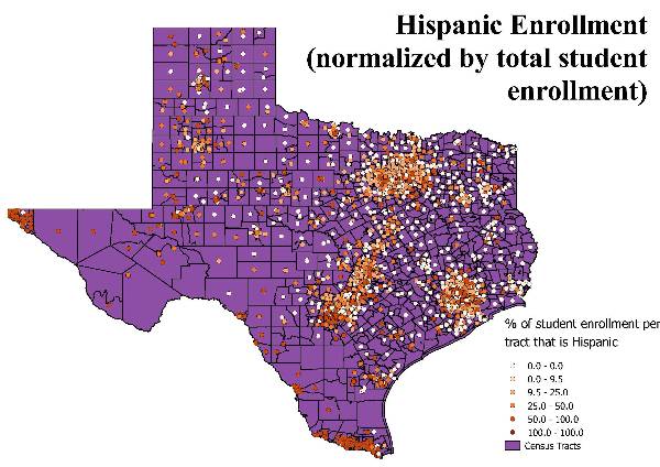
For any given region that sent students to TTU, this map presents the proportion of those students that were Hispanic. The previous map tells us, for instance, that we've only had moderate success in recruiting from El Paso and the Rio Grande Valley; this map tells us, however, that among the students that did come from these areas, a remarkable proportion of them are Hispanic. Perhaps this is not news given the demographics of these areas. Yet it also seems worth noting the extent to which this is not just a story of one or two highly Hispanic regions. Modern Texas is a heavily Hispanic state. Though we have recently crossed 25% Hispanic enrollment at TTU, this significantly lags the demographics of our high schools, which have been majority Hispanic since 2013.
College of Arts & Sciences
-
Address
Texas Tech University, Box 41034, Lubbock, TX 79409-1034 -
Phone
806.742.3831 -
Email
arts-and-sciences@ttu.edu