
Section 4-5: Scatter Plots and Lines of Fit (pages 187-192)
-
Demo Course

- TTU K-12 Demo Courses
Section 4-5: Scatter Plots and Lines of Fit (pages 187-192)
Understanding Mathematical Terms
Refer to the English-Spanish Glossary, which starts on textbook page A39, if you need help with a definition or finding a textbook page with an example for a vocabulary word.
Explorations
Read and work through the Explorations 1 and 2 and Communicate Your Answer on page 187. The goals of this lesson are to understand how to read and interpret a scatter plot and, when appropriate, fit a line to the data. The explorations present two plotted data sets for you to work with, one with many more data points than the other. Then, check your answers below.
Answers to Explorations and Communicate Your Answer
Exploration 1 (page 187)
- Sample answer:
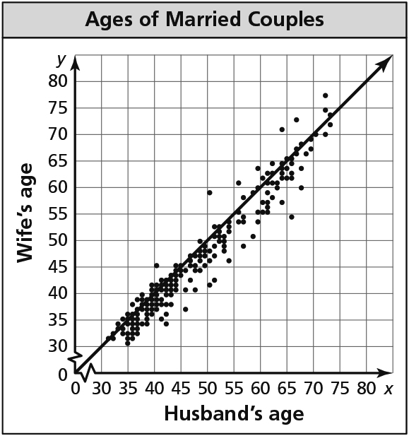
y = x; Estimate a line through the middle of the plotted data, then use two points on the line to find the equation. - Sample answer: The ages of the husband and wife in a married couple tend to be about the same; The equation shows they are equal.
Exploration 2 (page 187)
- Sample answer:
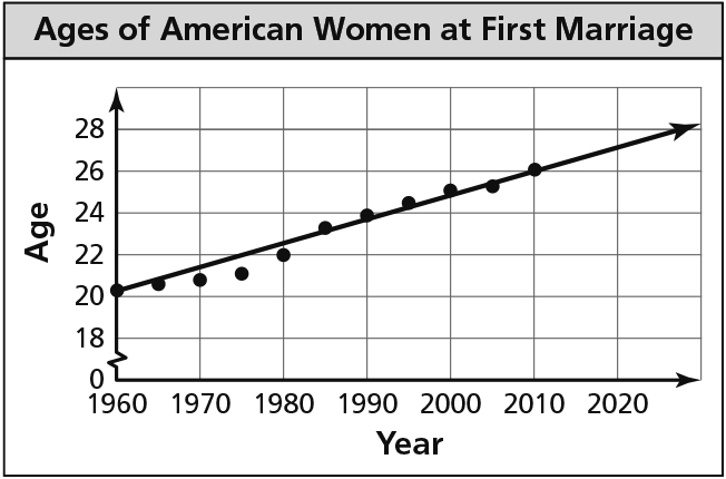
y = 0.1x + 20.1; Estimate a line through the middle of the plotted data, then use two points on that line to find the equation. - Sample answer: The median age at which American women first marry increases about 1 year for every 10 years.
- Sample answer: about 26.1 years old
Communicate Your Answer (page 187)
- Draw a line of fit on the scatter plot, find its equation, and interpret the slope and y-intercept.
- Sample Answer:
The data in the graph is from the Pennsylvania Department of Transportation.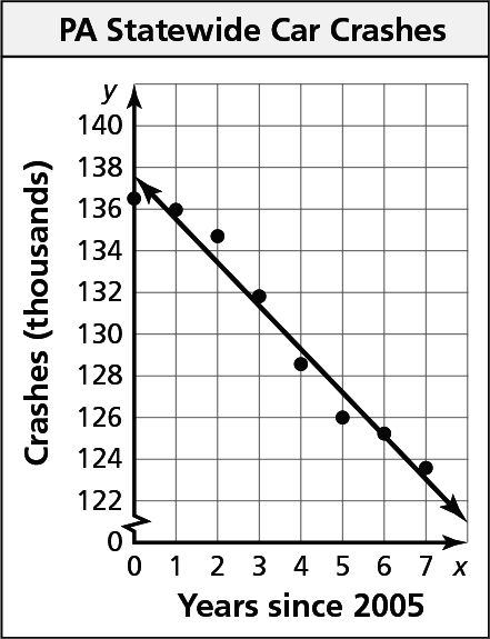
y = –2.1x + 137.5; Estimate a line through the middle of the plotted data, then use two points on that line to find the equation.
Section 4-5 Lesson (pages 188-190)
In this lesson, the concept of correlation is introduced with a connection made to slope. The purpose of writing the equation of the line of fit is to make predictions. The equation becomes a model for the data set, describing its behavior. Additionally, you should always consider the slope and y-intercept and then interpret each in the context of the situation in which it makes sense.
Study Examples 1 through 3 carefully. A correlation is a relationship between data sets. You can use a scatter plot to describe the correlation between data.
Positive Correlation
As x increases, y increases
Negative Correlation
As x increases, y decreases
No Correlation
The points show no pattern
Practice with the Monitoring Progress problems as you go, and then check your answers below.
Answers to Monitoring Progress (pages 188-190)
- 260 cal
- about 52g
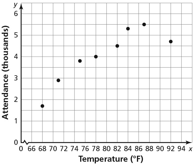
positive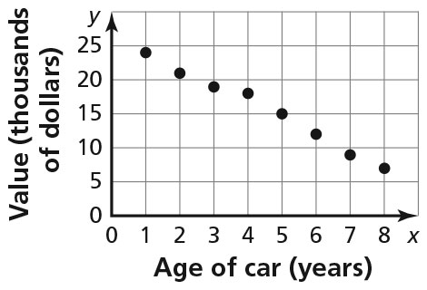
negative- Sample answer: y = 0.2x; The slope of 0.2 means the monthly car payment increases by $20 for every $100 increase in monthly income. The y-intercept of 0 means a person with no monthly income has no car payment.
Texas Tech K-12
-
Address
Texas Tech Plaza | 1901 University Ave, Lubbock, TX 79401 -
Phone
(800) 692-6877 -
Email
ttuk12@ttu.edu